New Graphic Concepts Take Shape for McDonald’s Stay-and-Play Activities
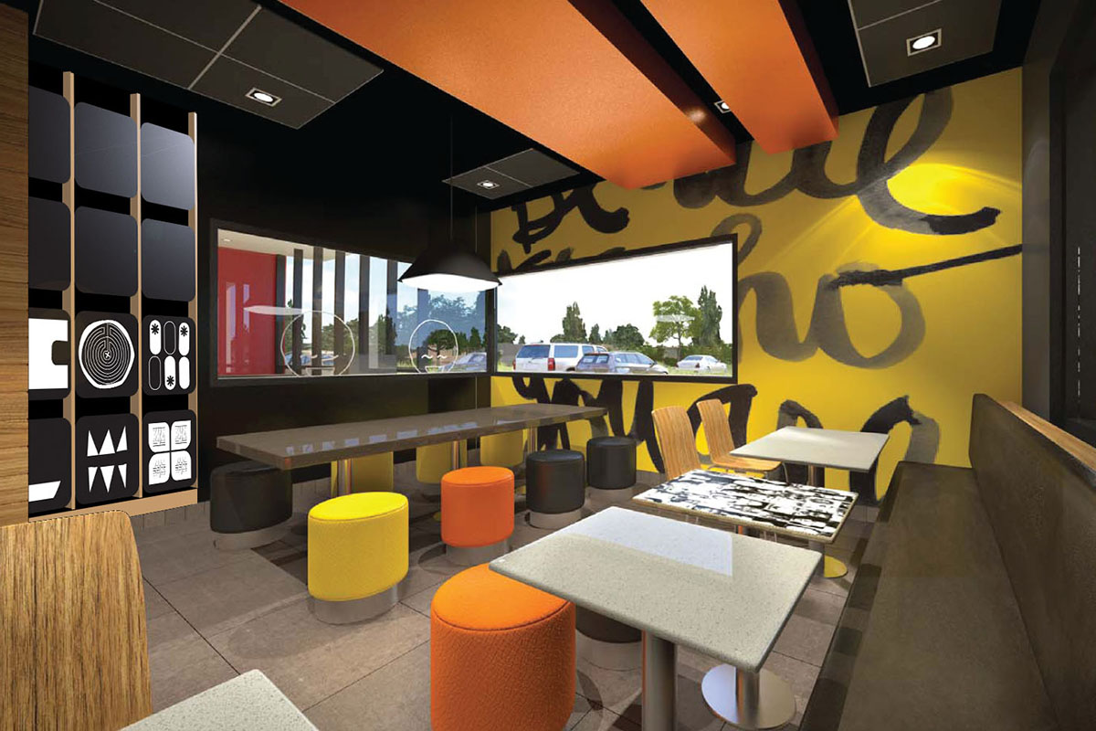
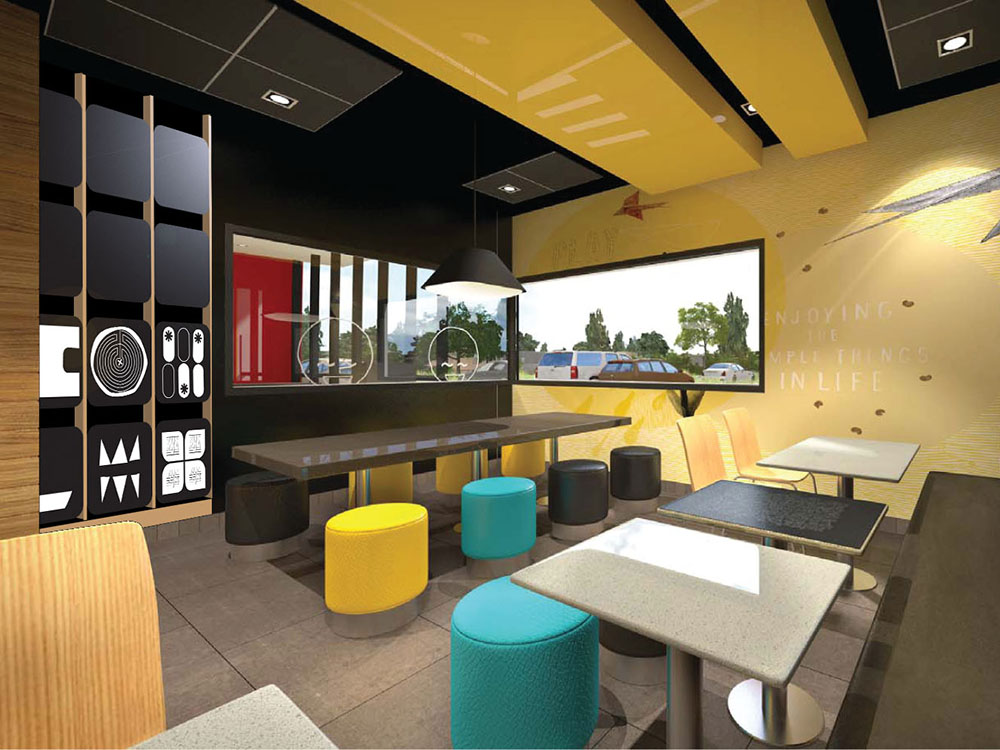
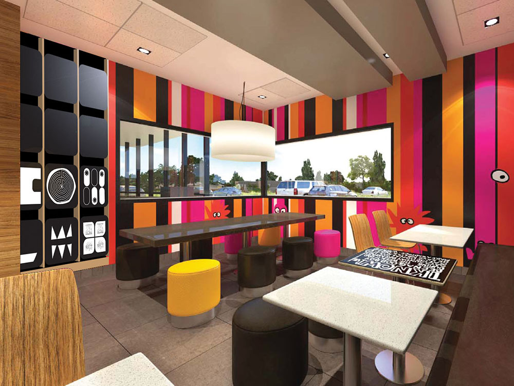
The McDonald’s Corporation enlisted koolgirlposse to develop and design concepts for a kids’ activity wall to be implemented in their restaurants’ playrooms. The graphic style would need to complement several new store design schemes developed for in the Asia/Pacific/Middle East/Africa (APMEA) markets.
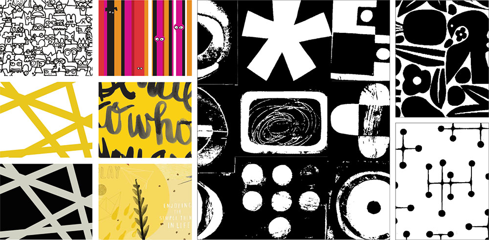
koolgirlposse took a Modernist approach, inspired by cut paper illustrations. Each activity panel features large graphic shapes to visually contain puzzles, drawing canvases, and word games. From afar, the panels graphically work together as a whole, and feel familial to the store design schemes, but individually become engaging games and imaginative drawing activities upon close interaction.
This modernist-inspired graphic direction leverages the bold statement made by the pre-determined décor patterns that use large hand-drawn type and assertive lines to set a casual, informal, and approachable mood. The abstract shapes of cut paper are consistent with handcrafted look and feel of the interior graphics.
Through the use of abstract shapes (in contrast to previous literal illustrations featured in playrooms) and the development of open-ended activities, koolgirlposse successfully elevated the quality of McDonald’s playroom graphics and level of children’s play for an improved McDonald’s Playroom experience.
